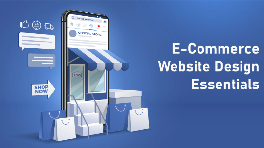
Given the extremely competitive eCommerce landscape, businesses cannot afford to overlook the impact of their design choices. Each design decision, from product placement to checkout flow, subtly influences a visitor’s chances of staying, browsing, and ultimately making a purchase. Every eCommerce brand should focus on making a set of strategic design choices that make their website function effectively and capture its full revenue potential. Let us discuss the all-essential design decisions that serve as the cornerstones of remarkable e-commerce web design.
User-Centric Design
When we say ‘user-centric design,’ we do not mean bombarding visitors with excessive information or micromanaging every step of their journeys. The old adage “less is more” holds true when it comes to ‘personalizing’ eCommerce websites. So, how do you organize info on your eCommerce site to deliver intimate user experiences, without overwhelming the visitors? Just invest in smart information architecture:
- Customers generally have a basic understanding of how eCommerce website layouts work
- They know where to find the desired information. For instance, users typically look for help or contact details at the bottom of the page.
- Including a chatbot or a “Contact Us” link in the top navigation menu is unnecessary
The goal is to minimize their effort as they browse through products of interest. Keep your user in mind while designing their journeys, and at every step of the way, reduce navigation complexity as much as possible.
A well-structured, yet simple and intuitive navigation structure can serve as every user’s roadmap. You do not need to show visitors two/three pop-ups with their personal info to hold their attention. Keep things simple and do not force users through multiple navigation layers.
Organize your product catalog into a hierarchy of clearly defined categories and subcategories. Avoid creating “shallow categories,” i.e., impressive-sounding text labels without corresponding subpages, as these waste valuable space in the navigation menu.
Make sure the same products never appear in multiple categories. And most importantly, keep conducting user research to determine if your navigation architecture needs further streamlining or personalization.
Read also: Custom Web Design vs DIY: What Makes Custom Design Special?
Homepage Essentials
A simple, easy-to-understand navigation structure will assure users that they are not about to feel confused, overwhelmed, or frustrated as they start their browsing journey. But, how do you build from that? By enabling visitors to discover whatever they need directly on the homepage. The homepage serves as the primary entry point for most eCommerce websites.
The goal of designing the homepage should be to impress visitors and streamline their journeys by minimizing the number of steps they need to take to reach the products they desire. Here’s how designers can achieve that:
- Present a curated selection of popular product subcategories on the homepage. This will make users bypass the main navigation menu or search bar and navigate directly to relevant product/service sections on your site.
- Implement a “progressive reveal” strategy. Instead of displaying your full inventory on the homepage, showcase only a limited set of featured products or product categories. Place links that state “learn more” (and take users to specific product pages) under each product.
- Our brains can process visual information at a faster rate than text. To impress visitors, leverage the power of visual communication. Add crisp, high-definition product images to the homepage to capture user attention instantly.
Compelling “hero shots” of the product on the homepage can effectively communicate your brand’s value proposition in less than a second.
Create a Convenient Menu
Mega menus that are packed with product and product category links offer users multiple navigation choices; however, most shoppers are not interested in so many options. Excessively large mega menus can obscure important content on the site and confuse users.
Minimize the visual footprint of all the menus on your site by keeping them short and simple. Also, implement a “hover-delay,” i.e., a short period where the user must hover over the menu before it activates. This will prevent accidental menu triggers, especially for mobile users.
Product Images
High-quality visuals can take any website to the next level; this is especially true for eCommerce sites. High-definition product images go beyond merely showcasing the physical product. They make the brand appear in a more appealing light.
A strong visual merchandising strategy plays a critical role in attracting customers, boosting sales, and establishing brand identity. Implementing “Quick Preview” options for product listings on category pages can make this strategy even more effective.
Giving visitors “Quick Previews” to products means allowing them to view product details without leaving the main product list. Why is this helpful? When visitors do not have to frequently switch between multiple listings to learn about products, they’re more likely to keep exploring.
Plus, by giving visitors “Quick Previews,” you will also get to show them the product descriptions and ratings. The descriptions can effectively showcase the product’s exclusive features and selling points while the ratings can further pique their interest.
Landing Pages and Conversion Funnels
Not all customers will arrive at your eCommerce store by manually typing in the URL. Many will discover your brand through advertising (Facebook ads, email campaigns, etc.). In such cases, landing pages will become your secret weapon.
These pages have one sole purpose: to convert visitors into paying customers. To achieve that goal, their design should be visually striking and optimized for conversion. They should clearly communicate the brand identity, product value proposition, and the reasons why visitors persist.
The checkout pages should also be similarly optimized for conversions. Simple things like focusing on collecting only essential information for order fulfillment/payment can make a huge difference in the user’s experience.
Does your eCommerce site feature all the ecommerce essentials? If not, avail of custom ecommerce web design services and add these essential elements to your site ASAP so that you can start driving more sales!